Microsoft introduced Self-Service Business Intelligence (BI) back in 2009 with Power Pivot for Microsoft Excel 2010. At that time, Microsoft did not make any big announcements, and everything started slowly. Some enthusiastic users adopted the new technology, but the vast majority of Excel users either ignored it, or were frustrated at being unable to use it because the version of Microsoft Office installed at their company did not include the add-ins.
For several years, Microsoft collected the feedback of users, carefully considered what was missing in the world of end-user BI, and then crafted the version of Power BI that’s available to us today.
Power BI Desktop is an evolution of the add-ins available in Excel: Power Pivot, Power Query, and Power View. Instead of using three different add-ins all launched separately from inside Excel, there is now one integrated tool.
Power BI Desktop is a free stand alone report designer and it is really easy to use. The interface is intuitive, which means the learning curve is very short, even for those with little knowledge of how to analyse data.
Here are three reasons why I love Power BI Desktop.
1) It’s easy to connect to multiple files and ‘merge’ data
Loading data from different sources is simple. As well as the typical Excel and csv files, you can connect to 70+ different types of sources such as Google Analytics, Sales Force, Azure. Anything you want to do is largely a matter of drag and drop, or checking boxes.
Here’s one of my favourite time saving tricks: All four csv files in this folder can be quickly merged into one table in one go.
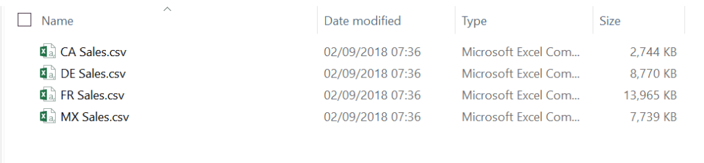
Four CSV files
No need for to open the files and copy/paste. No need for code. It takes just a few simple clicks in Power BI to combine the files and start to analyse the data. The combined table from these four csv files has over 11 million rows – which is 10x more than an Excel worksheet can hold!

And with just a few more clicks I can create an interactive map and chart from this combined data:
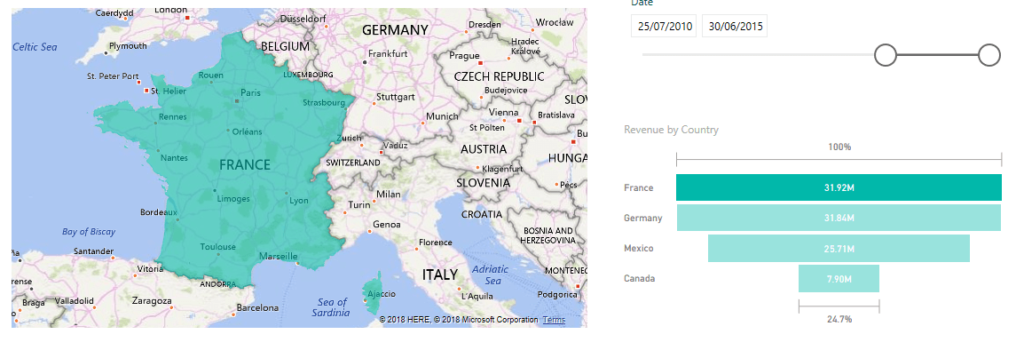
A map and chart from combined data
2) It’s easy to prepare data
Not only can I connect to large data sets, I can save time on the repetitive ‘cleaning’ and ‘transposing’ tasks that I need to do, in order to be change the data so that it is in a format I can work with. I can take data that looks like this (which may look pretty, but is definitely unworkable for what I need):
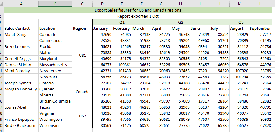
Preparing data
And turn it into a format that better suits analysis. This involves filling in gaps, unmerging and unpivoting data. This can be achieved in just a few clicks with no need for macros or complicated formulas:
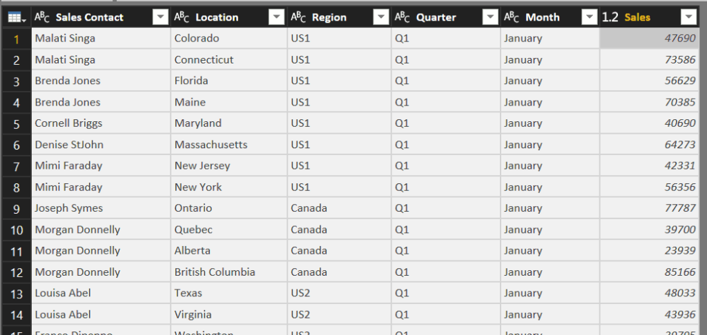
Now that I have the correct format, it takes just a couple more clicks to create an interactive report. Here I can click on a region in the table and the line chart immediately updates to show me the pattern of the sales:
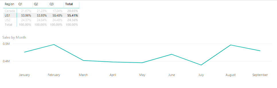
Line chart displaying pattern of sales
And all this – from receiving the data to creating the report – in under 5 minutes!
3) It’s easy to ask questions about your data
With Power BI, you have the ability to carry out analysis of your data by asking it questions, in plain English — no special code or syntax is required. This feature is called natural language queries, and with it, you can ask Power BI to perform tasks in much the same way you would ask one of your colleagues.
For example, double click in an empty part of the canvas (the report) and the ‘ask a question’ box appears. Type what you are interested, for example “Sales for ma… ”
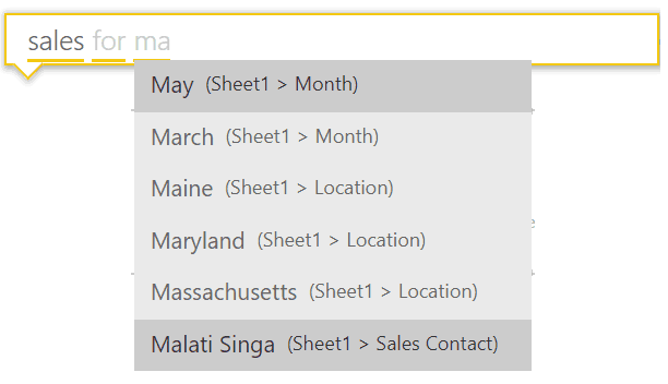
As you type, Power BI presents you with meaningful queries. Complete your question and a chart or table will be displayed that best shows the data:
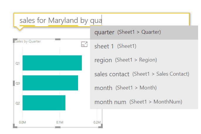
Example chart or table
Of course, to get more complex analysis you can create formulas and make the most of the powerful DAX language – but this way of just typing what you want is a great way to get started.
Related Blogs
- What is Power BI and Why Should You Use it? – Serena tells us more about Power BI and the why it such a popular way of analysing data in Excel.
- How to Create a Pivot Table in Excel – Nicky will show you how to create a basic Pivot Table and display your data as percentages.
- More Pivot Perfection – Learn how to get your Pivot Table to put your filtered data on different sheets.