Most of us will say “YES” to most or all of those questions, if for no other reason than we’d be embarrassed to admit otherwise. We also have lots of data which should have informed our claimed understanding, but how many of our assumptions and beliefs about our performance have been challenged, dismissed or reinforced by looking at our data?
Probably, and here I’m making an assumption, very few.
This could be for many reasons. Data is boring and, at first glance, impenetrable. We often have no idea at all why we have the data we have, often data is amassed as some sort of corporate comfort blanket, collected with the utmost diligence and never used.
We know that all this data could help us understand our business better – but data is just, well, data really.
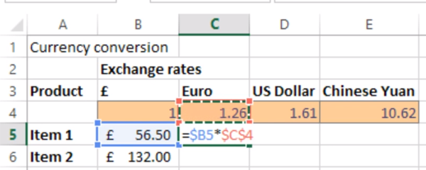
This is where Microsoft Excel comes in. After a bit of sorting there, an auto filter here, we start seeing little glimpses into the potential our data promises.
These odd little nuggets of information may well be useful but they’re not pretty or easy to share. So, we may start playing with some formulas – SUMIF(S), COUNTIF(S), and AVERAGE. All very fine formulas that have served us all well, but once again, can be a little labour intensive.
What we really need is some way of turning our Data into Information. I remember vividly the moment I understood the difference – Data is just data, it tells you very little if anything at all. It only becomes information when it’s distilled into small chunks that tell you something you didn’t know (or confirms something you only guessed).
And here is where I finally introduce the Pivot Table.
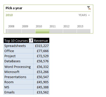
A basic Pivot Table.
The Pivot Table is an amazingly sophisticated feature of Excel, which, once mastered, can transform massive amounts of data into meaningful information. This doesn’t mean your assumptions and guesses are worthless; they are the starting point. We often start using Pivot Tables and Pivot Charts to test these assumptions and it’s often pleasing to find how our close our instincts can be to reality.
Pivot Tables and Pivot Charts gives us the facility to quiz our data in many different ways, and to place those summaries right next to each other. It allows you to transform that data with a few simple clicks – and it can become quite intoxicating to realise what control you can finally take of all this data!
But rather than be proved right, how much more exciting is it to be proved wrong? The biggest thrill I’ve had discovering Pivot Tables was when a simple Pivot Table proved that something I believed to be a “fact” about a course we ran was completely wrong. That was fantastic! This data, honed down to useful information, had told me something that completely changed my understanding of a part of our business that I was meant to be the expert in!
So why is being wrong so right? Often, you might be delving into this data because your organisation wants to make more, spend less, be quicker, be bigger – so finding out where you’re wrong is a great place to start. Challenge those assumptions, find the hidden stories and then share them with the rest of your organisation with some wonderfully informative Pivot Tables, Pivot Charts, and Dashboards.
Related blogs
- How to Create a Pivot Table in Excel — Watch this helpful video to learn how to create a pivot table with your data.
- How to Group Dates Together in a Pivot Table in Excel — Make sense of complex data by grouping dates together on your Pivot Table.
- More Pivot Perfection — Learn how to get your Pivot Table to put your filtered data on different sheets.