But when should you use a pie chart?
Whether you are trying to fight for an important cause like Florence Nightingale, show where your website traffic comes from or just want to show your sales over the last year, pie charts can be really effective – big, bold and simple. But they can also be muddled, messy and confusing. What makes the difference is the data you are trying to chart. Not all data is suitable for all chart types and Pies are particularly vulnerable to having the wrong data used.
If we consider the table of data below that we have three rows of data organised into five columns. This data will not make a good pie chart!

Data not suitable for a pie chart!
If you try you might end up with a doughnut chart a bit like the one below… urgh!

What you might end up with…
Pie charts are better suited to one data series (a row or column of data), where you want to show in what proportions the data is divided.
Totals, or the rows or columns, give data that will be more appropriate to a good old Pie chart!
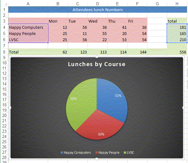
Same data, but with totals

Above data turned into a pie chart!
Excel can even add percentages!

Pie chart with percentages
Don’t forget, all of our IT training courses include two years of free access to our IT Helpline. The IT Helpline is staffed by our IT trainers, with support available by phone and email. You can contact our team as many times as you like about the material covered on your course.
Related Blogs
- Save Time in Excel with Autofill – Learn how to use the useful tool Autofill. Nicky explains how in the two minute video.
- How Microsoft Excel Can Increase Your Productivity – Billy talks about some of the reasons why Microsoft Excel is so indispensable to productive workplaces in this blog.
- How to Create a Pivot Table in Excel – Pivot tables are the perfect way to sort and analyse data in Excel. This two minute video takes you through the process of how to do so.
- Calculations on a Filtered List in Excel – Darren talks through the process of how to create a dropdown filter in your Excel spreadsheets.